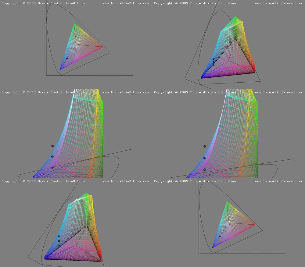
The chromaticity diagram is commonly used to evaluate a color against a gamut. The presumption is that if the chromaticity of the color lies within the gamut boundary (typically a triangle), then the color may be reproduced on that device, or may be represented by that color system. But color is three-dimensional and a chromaticity diagram is only two-dimensional. Because of this difference, using a chromaticity diagram to determine whether or not a color is in-gamut may lead you to a wrong conclusion.
The missing dimension on a chromaticity diagram is luminance. By including this third dimension in the study, a proper conclusion may be drawn.
To illustrate, consider the following figure showing a color plotted on a chromaticity diagram. Actually, the example shows three colors having a common chromaticity, but different luminances. Also drawn (in colored wireframe) is the gamut boundary for the sRGB color system. When viewed in two dimensions, this boundary forms a triangle that encloses the colors being evaluated. When viewed in three dimensions, the boundary takes on a somewhat irregular shape.

The two-dimensional view would lead one to the wrong conclusion that the colors are all safely within the sRGB gamut. But when viewed in three dimensions, we see that one of the colors is out-of-gamut, one is in-gamut and one is on the gamut surface. Obviously, the two-dimensional view cannot tell the whole story.